
The importance of web form optimisation
When looking at online forms, there are a many different playing factors that must be taken into account if you want them to perform in an optimal way. In this article, we are going to take a look at the online forms of three different brands in the automotive industry in the Netherlands: Ford, Peugeot and Cupra.
The performance of online webforms is often taken for granted, but optimising them is an important aspect of conversion optimisation. Not knowing where and why users drop off on your webform is similar to running media campaigns and not looking at any report. Every marketer needs to invest time in researching their online forms performance.
Planning a test-drive: it should be easy right?
The web forms that are going to be compared to each other, are the forms on which a potential customer can plan a test drive with a car. Every car manufacturer has one of these forms on their website. The most important question these organisations have to ask themselves is: who would like to plan a test drive? When this question is answered and they have figured out which target audience they have to optimise their forms against, they can change the form accordingly to the preferences and characteristics of this specific audience.
The audiences for the brands we are looking at today are very similar.
Form comparison
All aspects of form optimisation are split up between a couple of different factors. We’ll look at the content of an online form and ask ourselves: which fields are necessary for me to have a visitor successfully convert? Next, we’ll have a closer look at the layout of the form: how can I design my form, to make sure the largest number of visitors convert? After that we’ll look at safety: can all visitors trust my form? Finally, we’ll look at technology: what technical optimisations can I apply to my online form?
Content
Number of fields
One of the most important rules of online forms is to ask as few questions as possible. The more your users have to do, the higher the chance they will not complete the form. Here are two main rules when trying to decrease the number of questions asked on your form:
- Don’t ask anything you don’t NEED to know, things like salutation and date of birth. If your visitors don’t really understand why they have to leave a piece of personal information, they are more likely to abandon the form and not convert.
- Don’t ask things twice. E-mail addresses, for example. We often see that users are asked to fill them out twice, this just takes up time unnecessarily. The same goes for passwords: provide just one field. The longer the form, the lower the chance of completion.
Ford does this well; they don’t ask for the information they do not need. Just the name of the visitor, their mobile number, and their e-mail address.
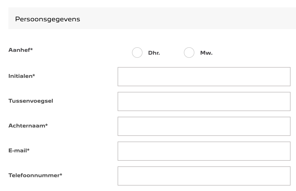
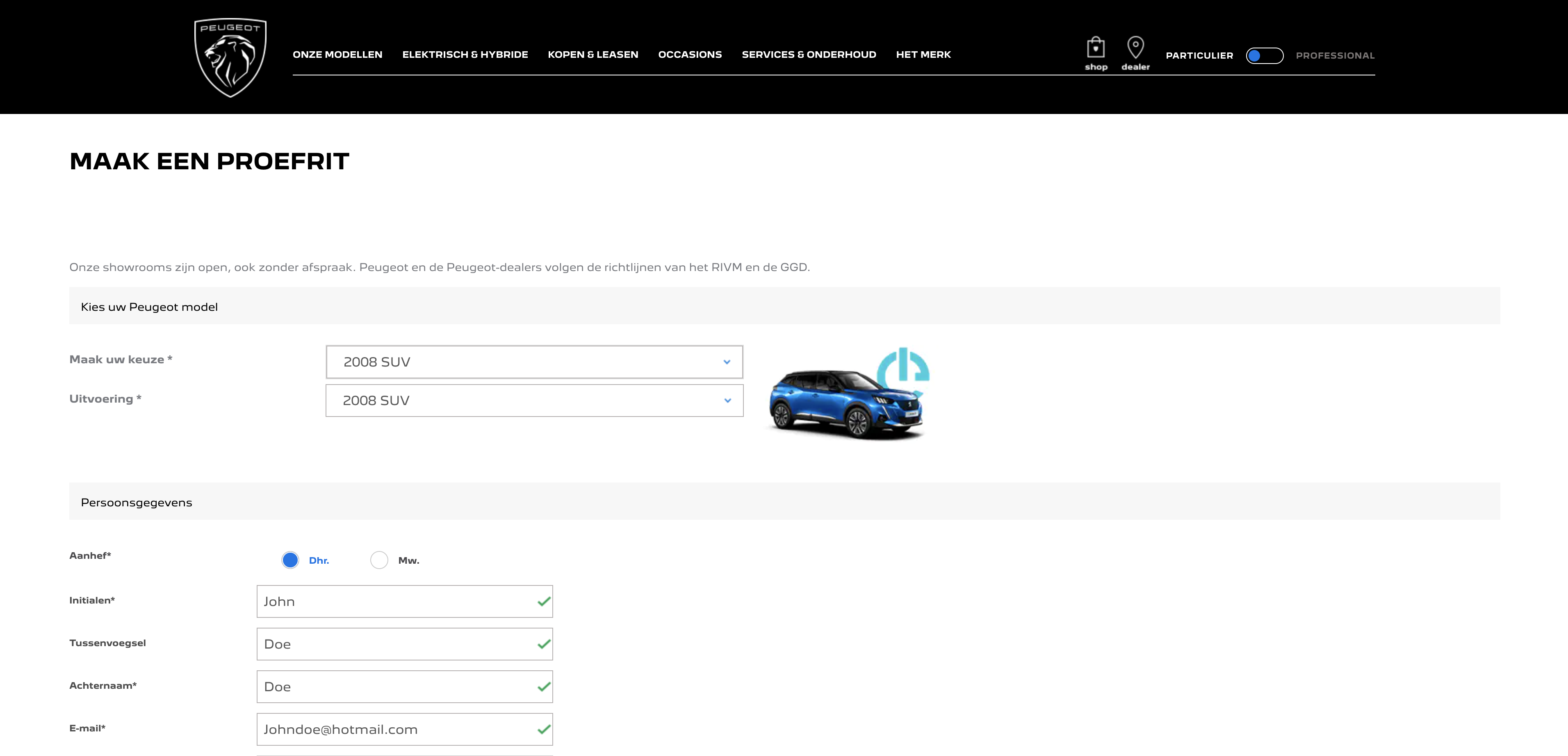
Peugeot’s form looks similar to Ford’s, but does have more fields. The form has an extra radio button for a salutation, as well as an extra field for a preposition.
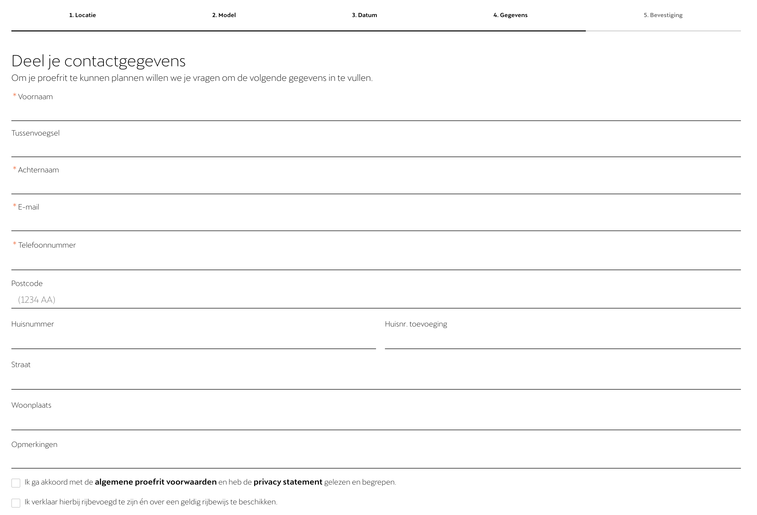
Cupra’s form looks the least optimal in this case: there are 11 fields in the form, and they ask for address details as well. At the same time, they did not put an asterisk on those fields, which means they are not mandatory. If you don’t necessarily need to have some specific information, it is best to just not ask for it at all.
Peugeot NL test-drive form
Cupra NL test-drive form
Design
Clear CTA’s
Clear call to actions will directly impact your conversion rates. If you want your visitors to book a flight, state “Book flight” in your button. An effective call to action will draw the user’s attention and motivate them to convert.
Ford has stated “Verzenden” in their button which means “Send”. This CTA will not grab the users’ attention and will not increase their chance of converting. If they were to change this into something like: “Book now” or “Confirm appointment”, the conversion rate would be higher.
Cupra has the entire form divided up into 5 different segments, picking a car, a location, a time slot for the appointment and appointment details. After clicking the “next” button, your appointment is set, which is a little unexpected. With a clearer CTA copy, these buttons can prove to be more effective and increase conversion.
Ford CTA

Cupra CTA

One of the first things you’ll notice on the Ford test-drive page, is the large amount of whitespace between the fields. It is important that users get a good impression instantly of how long it is going to take to fill out the entire form. Put as much information as possible above the fold. Unless you have a large number of required fields: in that case it is best to split your form into different pages, like the Cupra form.
The field labels on Ford’s page are inside of the fields and jump to the top of the field after the user clicks in the field. This is the best way to do this because you take up as little space as possible and you don’t show phrases like ‘first name’ twice. At the same time, user’s still see in what field they are typing, as the label has moved up as soon as the typing started.
The test-drive form for Peugeot looks a lot different. There is less whitespace between the fields ,which makes the form look organised. However, the field labels are located far to the left of the fields, which makes the total form look larger than necessary.
Even though Cupra divided the form into different pages, the page on which the personal information is asked for is enormous. The fields spread out across the page and take up a lot of space. Making your fields this long is unnecessary and scares your visitors.
Ford field size

Peugeot field size

Cupra field size

Adding a progress bar shows your users in which step of the conversion process they are. Showing a progress bar triggers the intrinsic need to finish something, in this case, the form. Only Cupra’s form shows something like this. The form is divided in steps which are stated at the top of the page.
Cupra progress bar

Some visitors prefer to do as much navigation as possible with their keyboard. To make sure these visitors have the best experience on your form, enable that the form is first field focused. This means that as soon as a visitor lands on a form page, one can immediately start typing in the first field without the need of first clicking on it. In addition, when your form supports natural keyboard navigation, it means users can navigate to the next field by simply pressing the TAB key and can enter drop-down menus by hitting the spacebar.
Cupra does this very well: as soon as a user enters the page of the form, they can start typing in the first field. Also, when pressing TAB, they skip to the next field in line.
Both Ford and Peugeot don’t have their pages optimised in this way. The first focus is not on the first field but somewhere else on the page and it takes many TAB presses to get to the first field.
Technology
To increase conversion on your webforms, it is important to also look at improving the usability of your forms by implementing technical optimisations. This way you can make it easier for your visitors to complete the forms.
Autocomplete
Autocomplete is a tool that helps visitors to fill out the form even faster. With their personal data stored onto their browser account they can fill out most of the form with one mouse click. Unfortunately, browsers can’t save all address types. Browsers can save a users’ address with just address lines but there are many forms that require a user to fill out their ZIP-code, street name and house number separately.
Peugeot autofill
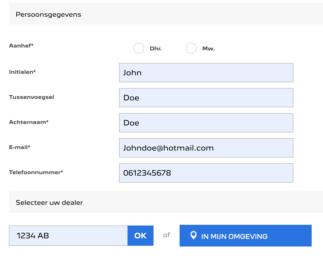
Inline validation can be used to motivate users by creating a sense of progression. As they go from one field to the next, they immediately get notified that their input is correct. This is because the users’ input is validated as they type. In other words, they get notified immediately if there is an error (incorrect format) while filling in the form. However, you should be careful with these notifications because your users can get frustrated by potentially showing errors too soon.
To make your users feel good about completing a field, it is smart to let them know they are doing it correctly. Peugeot does this well by showing a green check inside of a completed field. This motivates the user to go to the next field. Neither Ford nor Cupra has implemented this. The only problem with Peugeot’s form is that the fields which are completed with autofill, are not checked right away, but only upon clicking the CTA button. That might confuse the user.

Reliability
Can a user assume their information is processed in the right way? How can you make your online form look ‘safer’?
SSL-certificate
Something really general and a must if you want to give a professional impression. All brand websites in this comparison have this certificate and are therefore operated with a protected connection.
Company brand on form
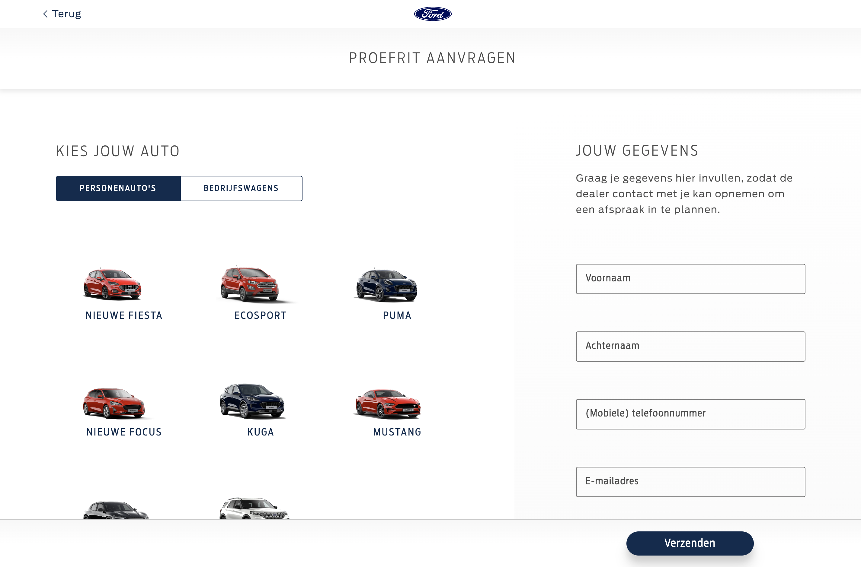
To increase the trust on your form, you can make sure the users will recognise your brand on the designated page. You can do this by displaying your USP’s, always showing your logo on the page and using your brand colors throughout the page. Ford does this well; they used the same colors on the form as they use on the rest of their website, and they also display their logo. However, they do not show their USP’s on the page.
Conclusions
Understanding webform performance can be woefully complicated since there is not just one single way to go.
All three cases have good things and bad things, but much can be gained. It is interesting to see how different these forms are, while the service they offer is exactly the same.
Optimising your online forms is an important part of general conversion optimisation. Paying attention to the improvement of the user experience on your form is therefore essential. Make sure to always keep our tips in mind when designing or improving your web forms. Here is a short list of the most important things we have learned today:
- Make your form as short as possible
- Make your form look like it is not much work to complete
- Motivate your visitors by using inline validation and success indicators
- Make sure your web form is first field focus and easy to navigate through by keyboard
- Make your brand and your logo reappear on the web form
The next step is to use form analytics and understand where your users drop off. And what is causing this.
Need help? Get in touch with our team and let’s start a conversation.
