Table of contents
Executive summary
The potential of form improvement for generating more test-drive leads
This benchmark report highlights a critical opportunity for automotive brands in the Netherlands. To drive more qualified leads to dealerships by optimising test-drive request forms . As Test-drive forms act as a crucial conversion point. It bridges online interest with physical dealership visits. Test-drive forms are a key step in converting online interest into car buyers. But despite heavy paid media investments to bring, engagement remains low:
What are the average performance rates of test-drive forms?
- only 11% of visitors start filling out the form
- 47% of those who start, try to submit the form
- only 5% complete the form with success
This highlights a major inefficiency in marketing ROI. For Exatom a reason to research the current status of test-drive forms in the Netherlands. Poorly designed forms create unnecessary friction, leading to user frustration and abandonment. Whether due to excessive fields, confusing steps, slow performance, or accessibility barriers. Conversely, optimised forms can boost completion rates. This ensures more high-quality leads reach dealerships.
The analysis was carried out using the Exatom form audit tool. This audit tool focuses on technical evaluation of HTML structures. It does not take into account actual user behaviour. The data collected is between November 2024 and February 2025.
This reasearch covered desktop test-drive forms from 39 automotive brands in the Netherlands. The research is concentrating on personal information fields. Porsche is included with a general contact form, as they don’t offer test-drives. Cupra, Mercedes, and Jaguar are excluded. This is due to technical limitations or market inactivity during the assessment period.

Test-drive forms: there is no consensus about the ideal form
Some brands still ask users to select the car model. Even after they click through from a model page. This creates unnecessary effort and cognitive load.
Additionally, there is no clear industry standard about the number of form steps. Some brands choose single-step simplicity. Others create multi-step journeys, which can be helpful if done right. But often lead to higher abandonment when they are too long or lack clear guidance.
Dealer locators are often used, with most brands offering them. This has a noticeable impact on user satisfaction and form completion. Whether they rely on lists, maps, or combinations. Particularly on mobile devices where map-based solutions often become cumbersome.
The number of personal data fields also varies a lot. Brands are balancing here. On one hand, the would like to collect rich customer information for CRM purposes. At the same time, they would like to keep forms short enough to avoid user frustration.
Accessibility remains a weak spot for many brands. Even with the European Accessibility Act coming into effect in June 2025. This is leaving them vulnerable to compliance risks. And excluding users with visual or motor impairments. Furthermore, Site Performance also differs greatly between brands. Some load their forms in under 0.25 seconds, while others take several seconds. Longer load times is causing impatient visitors to bounce. Stylistically, forms with consistent field alignment perform much better. This is true as well when labels are placed above input fields. The same for appropriate font usage and and visibility without scrolling. Better than those cluttered or hidden below the fold. Usability audits also reveal that basic elements are missing in several brands’ forms. Like autocomplete, intuitive dropdowns and clear call-to-action buttons. As well as logical keyboard navigation. This is hindering efficiency and frustrating potential customers. Additionally, poor use of HTML best practices further damages user experience. Such as incorrect input field types or missing form tags. This impacts mobile usability and autofill performance. Which are crucial for modern user expectations.
How did the brands score?
This graph summarises how car brands rank on the overall Exatom audit score. Toyota leads with the highest score. It’s achieving a near-perfect rating of 10. Demonstrating best-in-class form performance, usability, and technical compliance. A large group of brands, including DS, Smart, Fiat, and Lynk & Co, fall into a strong mid-range cluster. They are scoring between 7.5 and 9, indicating good but not flawless form quality. Another substantial group of brands score around the 6.0–7.5 range. This reflects average execution with room for improvement in design, usability, or performance. At the bottom, brands like Renault, Dacia, Porsche, and Ford score below 6. This score is highlighting significant weaknesses in form structure, accessibility, or loading speed. All of which risk frustrating users and losing valuable leads. Some brands clearly invest in optimising this key digital touchpoint. While others lag far behind. And therefore missing out on conversion potential.
To conclude
Brands that invest in optimising their forms will improve their marketing ROI. And significantly increase their lead capture potential. It’s about reducing unnecessary fields and re-filling user selections. By optimising dealer locators and user-friendly designs. Those who fail to do so risk falling behind competitors. Competitors who are already leveraging form optimisation as a key digital advantage. In a highly competitive automotive market.
In summary, optimising test-drive request forms is not just a UX project. It is a direct revenue opportunity. Brands that invest in form improvements stand to gain a competitive advantage. By converting more website visitors into valuable dealership leads. This drives both operational efficiency and sales growth.

1. Introduction
The purpose of the report
The purpose of this benchmark report is to analyse and compare test-drive forms. This is done across 39 automotive OEM brands in the Netherlands. With focus on the technical and design differences. All these forms serve the same purpose. Which is allowing potential customers to request a test drive. This report highlights the significant variations. In their structure, design, and overall quality. By showcasing these differences, it raises a question. Whether all brands place the same level of attention, expertise, and value on optimising their forms for performance. Some brands demonstrate best practices in usability and conversion optimisation. While others may fall short. It suggests that the strategic importance of optimised forms is not universally recognised. Not across the automotive industry.
The scope and methodology
This benchmark report analyses the test-drive request forms of 39 largest automotive brands. Brand that are selling new cars in the Netherlands. With focus is on their technical implementation, design, and user experience. Exatom conducted the analysis using the Exatom form audit tool. This tool evaluates the form based on the HTML code. It does not take into account user behavioural data. Using form analytics would have provided more depth. But this would require the Exatom code to be present on all 39 automotive websites.
The scope includes only desktop versions of these forms, with the data collected between November 2024 and February 2025. The assessment primarily focuses on the personal information section of the form, with additional insights into form characteristics such as single versus multi-step structures and other key design elements. While most brands had dedicated test-drive request forms, Porsche was included despite using a general contact form. However, Cupra and Mercedes were excluded due to their forms utilizing a shadow-root structure, which cannot be scored, and Jaguar was temporarily excluded as they are not selling new cars during the analysis period.
Why Test-Drive Request Forms Matter in the Automotive Sales Funnel
Test-drive request forms play a key role in the automotive sales funnel. They are a major step between online interest and visiting a dealership. For many buyers, booking a test drive is the first real action in their buying journey. It moves them from research to direct contact with the brand. A well-optimised form helps make this transition smooth. It cuts down on friction and ensures more leads make it to the showroom.
Test drives show a strong buying intent. How well the form performs has a direct effect on lead generation—and sales. A form that’s too long, unclear, or hard to complete can cause users to drop off. When this happens, potential buyers may leave and consider a competitor instead. On the other hand, a form that’s clear, short, and easy to use improves the experience. It boosts conversion rates and delivers better-quality leads to dealers.
Test-drive forms also show how mature a brand’s digital experience is. Brands that build optimised forms show they value the customer journey. In a competitive market, this can set them apart. Car brands can increase the number of leads by making forms smooth and effective. This grows showroom visits, and boosts overall sales. But test-drive forms are not just important for sales. They also impact return on investment (ROI). Automotive brands spend heavily on paid media to bring buyers to their websites. But test-drive forms often underperform, creating a big gap in the funnel.
- Only 11% of users who land on a test-drive form actually start filling it in. This means 89% leave without even engaging
- Of those who start filling in the form, an average of 47% reach the submit button
- Ultimately, only 5% of users complete the form and successfully convert into a lead
This means most high-intent visitors—brought in through paid campaigns—leave without converting. A better form design can fix that.
An optimised test-drive form is key to improving lead quality. And create a high return on marketing spend. Even small gains in form starts and completions can lead to more test drives and higher sales. Brands that don’t improve these forms risk wasting their media budgets. Those that focus on ease of use and conversion optimisation can gain a strong advantage.
In short, test-drive forms are critical. They connect marketing investment with real sales outcomes. Making them better helps brands capture more leads. Booking more test drives means winning more customers.
2. Test-drive forms: a design analysis of 39 car brands
2.1. Number of Form Steps
Automotive brands pick either a single-step or multi-step form for test-drive requests. This is based on multiple focus areas. Like user experience, data collection, and conversion optimisation. In this research, a step means a separate page where the user clicks to move to the next part. In this scope, splitting content into sections on the same page does not count as a multi-step form.
Brands using a single-step form focus on speed and ease. Showing all fields on one page helps users understand what’s needed right away. This lowers the chance of confusion. And works well when there are only a few fields, keeping drop-off risk low. But if the form asks for too much at once, it can feel cluttered and scare users off.
Multi-step forms are better when the request needs several choices. Common steps include setting a time and date, choosing a dealer, and adding personal info. We see brands applying multi-steps on a single page, but also seperate pages for each step. Some brands include a final review step before submission. Breaking the form into steps lowers mental effort and leads users through the flow. But, asking users to complete many steps can cause drop-offs if the process feels too long or tricky.
The choice between single-step and multi-step forms depends on how much information is required, the importance of guiding the user through a structured process, and the need to balance simplicity with data accuracy.

This variation suggests that brands balance different priorities when designing their forms. A single-step form simplifies the process. It reduces friction and increases completion rates, but may overwhelm users if too much information is required at once. Multi-step forms break the process into logical sections. Such as choosing a preferred time, selecting a dealer, and providing personal details. Some brands also include a final step for reviewing information before submission.
The absence of a standardised approach indicates that brands experiment with different structures to find the right balance between user experience and lead quality. The choice often depends on the complexity of the test-drive booking process, the amount of required information, and the brand’s strategy in guiding potential customers through the journey.
2.2. Dealer locator availability
A dealer locator on a test-drive form serves a functional purpose by directing users to the nearest or most relevant dealership, ensuring a seamless transition from online interest to an in-person visit. It helps users find a convenient location without manual searching, reducing friction and improving conversion rates. By automatically or manually selecting a dealer, the locator ensures test-drive requests reach the right sales representatives, improving response times and lead accuracy. It also enhances the user experience by simplifying the selection process, often using geolocation or postcode entry. In regulated markets, it ensures compliance with territorial agreements by directing leads to the correct dealership. A well-designed dealer locator should be intuitive, mobile-friendly, and require minimal input from the user to complete the form efficiently.

Most brands (21) use a list-only dealer locator. Seven use a map only. Ten combine both. A list is easier to scan, especially when it shows only nearby dealers. A map is more visual and interactive but can be harder to use. On mobile, many brands use the same test-drive form. In that case, a list works better. Maps on small screens often get crowded with icons. Users need to zoom and scroll a lot, which can be frustrating. So, a list-only view is recommended for mobile.

2.3. Browsed model preselected
When a visitor is looking at a specific car model and clicks the test-drive request button, the form they land on should already have that model selected. This small detail can make a big difference in the user experience. Preselecting the model removes a step from the process. The user doesn’t have to choose the car again, which saves time and avoids confusion. It also reduces the risk of errors. This is especially helpful for brands with a wide range of models, trims, or versions.
This approach creates a smoother, faster journey. When users see the model they were just looking at already filled in, it confirms they’re in the right place. It keeps them engaged and makes it more likely they’ll complete the form. Every extra step adds friction. And friction leads to drop-off. A seamless process helps more users follow through.
Preselection also shows that the brand understands user behaviour. It respects the time and intent of the visitor. Instead of asking them to repeat themselves, it guides them forward. This level of thoughtfulness builds trust and makes the experience feel more personal.

Some brands have partial solutions. Audi, for example, asks the user to select a model, but only shows the one they were browsing. So the system recognises the model, but doesn’t auto-fill it. The logic is there, but it doesn’t improve the experience. Subaru is similar. The model is in the URL, which means the site knows what the user was looking at. But the form still asks them to choose the model again.
To improve conversion and user satisfaction, the model of interest should be preselected. It’s a small detail that can make a big impact when a user clicks through to a form.
2.4. Day & time scheduling option
Letting users pick a day and time for their test drive makes the experience easier. It also feels more personal. It gives potential customers more control. And helping them fit the test drive into their schedule. This flexibility increases the chance they’ll show up and complete the visit.
When people can choose a time that works for them, it reduces friction. It feels more tailored and respectful of their time. That small detail can improve both engagement and conversion rates. It helps move the user smoothly from online interest to an in-person dealership visit.
At the same time, there are some challenges. The time slot a user picks might not be available. This can lead to frustration or delays. Especially if the dealer has to contact the customer again to reschedule. To avoid this, brands can add a real-time scheduling tool or show only open slots.
Another thing to keep in mind is form length. Adding a scheduling option means more fields for the user to fill in. If the form looks too long or complex, users might give up. Long forms often lead to lower completion rates. It’s important to balance convenience with simplicity.
Still, offering a scheduling option sends a positive message. It shows the brand is organised, flexible, and puts the user first. It also helps the dealer prepare for the appointment. Which can lead to a better test drive experience overall.


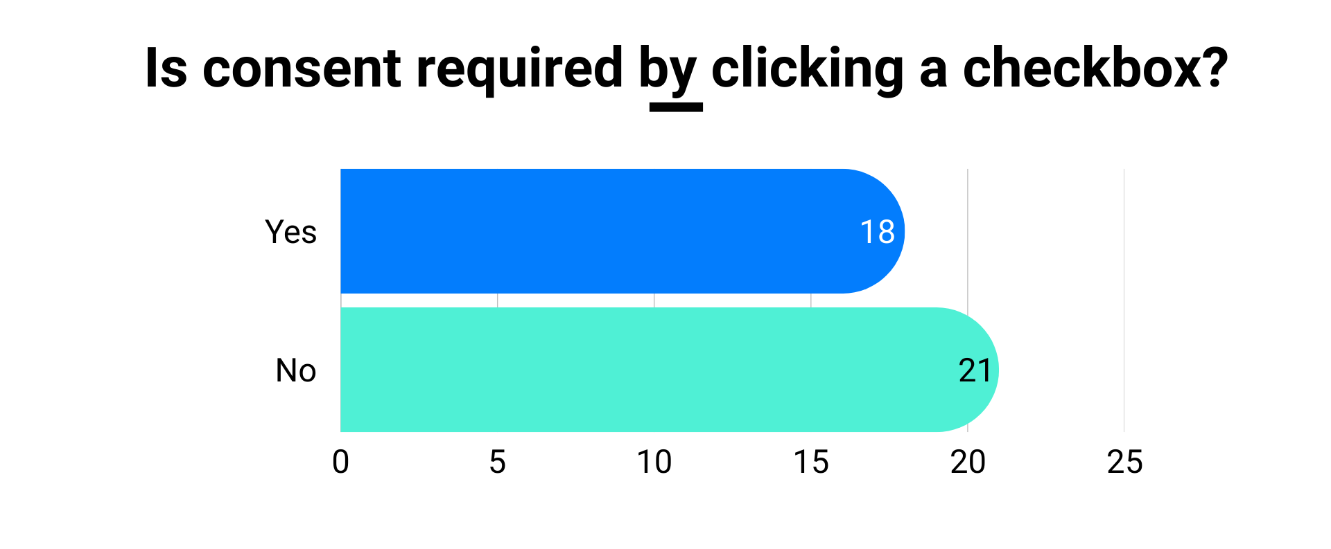
2.5. GDPR consent checkbox
The General Data Protection Regulation (GDPR) came into effect on 24 May 2016. And has applied since 25 May 2018. Its main goal is to reduce differences in national privacy laws and. But in practice, automotive brands interpret the rules in different ways. Some ask users for clear consent to handle personal data. Others others use legitimate interest as the legal reason. What is the most used method?
2.6. Number of Fields
How many fields are needed for a dealer to offer a test drive? The number of fields in test-drive forms varies. This often depends on brand strategy, target audience, and the stage of the customer journey. Some automotive brands focus on a smooth user experience. They use short forms to boost completion rates and reduce drop-offs. Others choose longer forms with 9–10 fields or more. Their goal is better lead qualification and collecting useful data for follow-ups. Data privacy rules also influence this choice. Some brands prefer asking for less information to stay compliant with GDPR and similar laws.
Internal teams also shape the form. Sales, marketing, and CRM departments often have different goals. Sales teams usually want more fields to qualify leads better. Marketing teams push for shorter forms to get more conversions. CRM teams focus on clean, detailed data. They may ask for precise names and full address fields.
In the end, each brand balances user experience, lead quality, compliance, and internal needs. The final number of fields reflects all these priorities.

Apparently there is no common agreement on this between the Dutch automotive companies.
The most common number is 6 fields, with a few outliers having as few as 3 fields or as many as 15. The median is 8 fields. The common denominator in all forms is the use of these fields:
• First name
• Last name
• Email address
• Phone number
2.7. ‘Tussenvoegsel’ field
The “Tussenvoegsel” field is common in Dutch names. About 24% of Dutch people (see our blog) have last names that start with words like “Van”, “Van de”, “Van ’t”, “Op de”, and so on. There are about 300 of these prefixes.
In 1994, the Dutch government decided to split names like “Van den Bremer” into two parts:
• Tussenvoegsel: “Van den”
• Last name: “Bremer”
Why? To sort names in computer systems by the actual last name (“Bremer”), not the prefix (“Van den”).
Some Dutch forms ask users to enter the tussenvoegsel separately. Others don’t. They just ask for the full last name. The reason for using this field is often coming from the CRM department. They ‘require’ this field in the database.
But browsers don’t understand this field. When users use autofill, their full name (family name) goes into the last name field anyway. In the automotive sector, around 44% of users use autofill for their last name. As a result, nearly 10% of test drive requests in the Netherlands end up with an empty tussenvoegsel field. And users are not correcting this.

Interesting: all private importer brands in the Netherlands—Volkswagen, Audi, SEAT, Skoda, Toyota, Lexus, and Suzuki —are in this group. Which makes sense. These brands create their own forms and don’t deal with forms created by European or global digital teams. But there’s a catch: they seem to ignore the autofill issue. Browsers often skip or misplace the tussenvoegsel. This creates errors in name fields, even when users fill forms correctly.
3. Test-drive forms: a benchmark of 39 car brands
Accessibility
Accessibility is a key part of digital experiences. It makes sure websites and platforms work for everyone. This includes people with visual impairments, physical disabilities, or other challenges. It also helps those in situations with slow internet or limited devices. Accessibility removes barriers that block people from using websites fully. When sites and forms are well designed, built, and updated, more users can find and use what they need. Everyone gets equal access to content, features, and services.
For digital marketers in the car industry, this matters a lot. Better accessibility can increase user engagement, improve customer satisfaction, and boost conversions. It also shows that your brand values inclusion and user experience.
With the EAA, these rules are now the same across the EU. This makes it easier for automotive companies to follow the law. It also removes market barriers and helps reduce costs. Experts estimate the industry could save up to €10 billion each year across all member states and companies.
For car businesses, following the EAA is a must. Not meeting the rules can lead to fines. It can also hurt your brand and limit how many people you can reach. But when done right, accessibility brings clear benefits. Using accessible design helps older users, people with disabilities, and those with short-term challenges. This widens your audience and builds trust in your brand.
Accessible digital tools—like websites, apps, and forms—also give users a better experience. That can lead to more leads, higher customer satisfaction, and better retention. Plus, companies that focus on accessibility often drive more innovation and stand out from the crowd.
In short, getting ready for the EAA is smart business. It helps brands grow, save money, and build a strong reputation. It also shows you care about all users—making your brand more inclusive and socially responsible.
This benchmark evaluates the accessibility of test-drive request forms across various automotive brands, using a scoring system based on five key factors: contrasting field borders, contrasting input text colour, contrasting field label colour, sufficiently large font sizes for labels, and adequate field label spacing. How do the brands score on accessibility?

On the other end, Opel, Volvo, MG, Lynk & Co, and Jeep fall into the “Need Improvement” group. Jeep scored the lowest with just 2.4. These brands risk excluding users with visual impairments. They may also face challenges meeting the new EAA rules coming in 2025.
Improving accessibility helps more than compliance. It creates better user experiences, increases conversions, and shows that your brand values all customers. For automotive brands, now is the time to act. Making digital channels inclusive and ready for the future.
Performance
Web performance is about how quickly the form page appears in the browser and is ready for user interaction. In other words, the page interactivity time. Poor-performing form pages are slow to display. And slow to respond to input. Running the risk of increasing online form abandonment. At its worst, bad performance causes content to be completely inaccessible.

On the other hand, Honda, Citroën, Hyundai, Porsche, and BYD perform significantly worse, with scores around 4.9 and BYD at 3.6, the lowest in the ranking. This means load times between 4-5 seconds, which can lead to higher bounce rates, reduced conversion rates, and frustrated potential customers. The causes might include heavy images, unoptimised scripts, poor server performance, or excessive third-party integrations slowing down the form page.
The stark contrast between the top and bottom performers suggests that page load speed is not universally optimised across the industry. While some brands have perfected it, others may need to prioritise performance improvements. This can be done by reducing unnecessary elements, enabling caching, optimising media files, and improving server response times.
Style
To audit the style of the test-drive forms, we ran an analysis on 5 different items:
- Field alignment and size: form fields should be aligned as much as possible and their size should be consistent.
- Form font consistency: it’s advised not to use more than two or more different fonts within your form.
- Form position: forms that are immediately in-view for your website visitor convert best.
- Form size: ideally your form is as concise as possible and should fit on a desktop computer’s screen.
- Labels above fields: multiple studies and benchmarks agree that labels above input fields are the best position. Certainly on smaller screen devices this has an advantage as the input field can be larger.

On the other hand, Volkswagen, SEAT, Peugeot, Mazda, and Hyundai rank lower, with Hyundai scoring the lowest at 3.7. These brands may have less intuitive or outdated designs, cluttered layouts, or inconsistent branding. Which makes their forms less engaging and harder to complete. Mazda’s form, for example, is below the fold and therefore not immediately visible for the user. Hyundai scored low on field alignment and font consistency. A poor visual experience can negatively impact user trust and lead to higher drop-off rates.
The clear performance gap suggests that aesthetic quality directly influence form engagement. Brands in the lower range should consider optimising their form design, improving readability, spacing, and visual hierarchy.
Usability
At Exatom, we audit the usability of test-drive forms by evaluating how easy it is for visitors to interact and complete them. Key factors include form design, input efficiency, and conversion impact. We check whether autocomplete is enabled to speed up form filling, analyse CTA button visibility and clarity, and assess dropdown and radio button usage for optimal interaction. We also review field repetition, ensuring users don’t enter the same data multiple times. Like confirm your email.Other aspects like keyboard navigation, input focus, responsive keyboards and captcha impact are tested. These are all aspects that influence a smooth and conversion-friendly experience.

Conversely, Zeekr, Renault, Opel, Porsche, and Dacia score poorly (2.0-2.9), signaling usability issues. Lack of autocomplete, unclear CTA buttons (like ‘Send’ instead of ‘Request your test-drive’), excessive form fields, and poor natural navigation contribute to these low scores. For example, Renault and Dacia show a magnifyer icon in the email field, which has no function and is not clickable. Also, a drop-down field is used when there are only three options. Best practice is to use radio buttons up to three options and a drop-down when there are four or more options to choose from. To improve, these brands should simplify form structure, enhance input efficiency, and optimise for mobile usability to reduce friction and increase conversion rates.
Web standards
Automotive test-drive request forms rely on a combination of HTML, CSS, and JavaScript. Adhering to web standards and best practices is essential for ensuring a seamless user experience across all devices. Proper implementation of form elements enhances usability, accessibility, and compatibility, improving overall conversion rates. That’s why this is weighted very high in our analyisis.
One common issue is the incorrect use of input field types. For example, using a standard text field instead of <input type="email" />. This best practice not only enables basic email validation. It also activates autocomplete and device-specific keyboard layouts. Showing the correct keyboard on mobile makes form completion faster and more efficient. Particularly on mobile devices.
Another crucial aspect is the proper use of <form> tags. Without a correctly structured form element, autocomplete functionality may fail (as the browser needs to guess), potentially leading to incorrect data filled-in. Causing unnecessary corrections and increased drop-off rates. Ensuring that each input field has a corresponding
In our audit, we evaluate how well automotive brands apply these web standards in their test-drive request forms. A perfect score (10) indicates full compliance, while a lower score suggests missing or incorrectly implemented elements. Identifying and fixing these issues ensures that test-drive forms are optimised for conversion, accessibility, and a frictionless user experience across all platforms.

Toyota, Lynk & Co, Smart, and Mitsubishi achieve a perfect 10.0, indicating that their test-drive request forms are built according to web standards, ensuring proper HTML structure, input field types, and form elements. Alfa Romeo (9.8) is also near perfect, likely having only minor issues. These brands offer better user experience, cross-device compatibility, and accessibility, leading to higher form completion rates.
Renault (3.6) and Xpeng (2.6) show partial compliance, but several best practices are missing, such as proper form tagging, input field types, and label usage, which could result in autofill issues, accessibility challenges, and mobile usability problems. Kia (1.6), Honda (1.1), and Lotus (0.5) rank the lowest, as these brands lack html field labels completely.
Brands with low scores must restructure their forms using proper HTML form tags, correct input field types. And labels to ensure a seamless experience across devices. Implementing these web standards will improve usability, form completion rates, and overall lead generation performance.
4. Conclusions: Ranking the Stars
Our benchmark analysis shows a wide range of performance among automotive brands when it comes to test-drive request forms. Toyota stands out as a clear leader. It scores near the maximum of 10 in performance, usability, and web standards. This reflects Toyota’s strong focus on creating fast, easy-to-use, and technically solid forms.
Other strong performers include Lynk & Co, Lexus, and Honda. These brands show consistently good scores across different areas. Their approach suggests a well-rounded focus on both form function and user experience. In contrast, brands like Porsche, Dacia and Renault, still have work to do. They show lower scores in key areas like ease of use.
We also found big differences in form features. Most brands (28 out of 39) preselect the model the user has been browsing, which makes the process smoother. But only 18 let users pick a preferred date and time. Dealer locators are nearly universal, with 38 brands using them. Of those, 21 only offer a list of dealers, while 10 provide both a list and a map, giving users more choice and clarity.
Form length also varies a lot. Nineteen brands use a single-step form, which makes it faster to complete. Others use multi-step forms, which can work well—but only if they’re well designed. The number of personal data fields ranges from 5 to 15, which affects how much effort users need to complete the form.
Clearly, there’s no standard approach across the industry. Brands are trying to balance getting enough data with keeping the user journey simple. The best-performing brands succeed by focusing on speed, usability, and legal compliance. Lower scorers tend to have outdated or inconsistent designs, especially in accessibility and user experience.
This leaves plenty of room to improve. Brands that simplify their forms, focus on user-friendliness, and follow modern best practices will be better positioned to meet user needs. And stand out in a crowded market.

5. About Exatom and the author
At Exatom, we know digital marketers aim for clear, measurable results. Strong-performing web forms and checkouts are a big part of that success. But while much focus goes into getting users to website and on the form, the final step—the form itself—is often ignored. This leads to missed conversions and lost revenue.
That’s why we built a cookieless, GDPR-compliant platform for form analytics and optimisation. It helps digital marketers boost form engagement and increase conversion rates—without adding friction. Backed by over 35 years of combined digital marketing experience, Exatom is trusted by top brands in automotive, retail, utilities, finance, and more.
Our mission is to help businesses get the most out of their web forms—turning visitors into customers.
This report was written by Stephan van den Bremer, Co-founder and CEO of Exatom. With deep experience in digital marketing and conversion optimisation, Stephan is focused on helping brands improve their form results. Connect with him on LinkedIn to explore more about form analytics and optimisation.
Addendum: screenshots of the test-drive forms
Alfa-Romeo

Audi

BMW

BYD

Citroën

Cupra

Dacia

DS

Fiat

Ford

Honda

Hyundai

Jeep

Kia

Lexus

Lotus

Lynk&Co

Mazda

MG

Mini

Mitsubishi

Nio

Nissan

Opel

Peugeot

Polestar

Porsche

Renault

SEAT

Skoda

Smart

Subaru

Suzuki

Tesla

Toyota

Volkswagen

Volvo

Volvo

Zeekr
